

.png)
.png)


#FCD307
Yellow Spark


#E7DCB9
Sandbox Clay

#FFBC00
Golden Goal

#000000
Deep Black

#E2E2E2
Calm Grey

#FFFFFF
Clear White
WESPARK BRAND GUIDE
The WeSpark name and logo were always intentional and full of meaning. We wanted to capture a single idea: “The world is full of problems, but together we can create new ideas to tackle them.”
Some of the early name candidates included Ideas from Planet Earth, Idea von Earth, Earthlings & Sparks, Concept Weaver, Sparkling Earth, and Escape Earth. In the end, we're glad we chose WeSpark—and we owe a special thanks to Carlos Pocasangre, the designer and artist who supported us throughout the creative process.
The final logo reflects our purpose: it’s unique, recognizable, works well in negative space, looks great in both virtual and 3D-printed formats—and it’s all built from just four simple elements.


Add Value to Others.
Be Present.
Irradiate Positiveness.
Show, don't tell.
Please Don't!
Don't make our Marketing mad, please!


Don't change colors.
This looks bad!


Don't stretch it.
It's not an egg!


Don't Rotate.
Why!? It's round already!
_edited.png)

Don't Vandalize.
C'mon! Please don't!


Colors & Minimum Logo Spacing
The minimum clear space is the width of one of the yellow circles of our logo.
Colors of WeSpark
The minimum clear space is the width of one of the yellow circles of our logo.
Visualization Examples
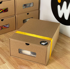
Every single one of these visuals was handcrafted by WeSpark.
We don’t use stock icons; we think, sketch, and illustrate everything from scratch to bring ideas to life.

The Logo
-
Two golden circles represent two lightbulbs, ideas, heads.
-
The heads combined with the "W" symbolize two people, "WE".
-
A white zigzag line represents a lightning, "SPARK"!
-
The same line has the form of the letter "W".
-
One black circle around represents the problems in our world.

Our Brand in Numbers
28
Countries Registered
Where our Trademark has been registered.


